
BORU
Naming | Brand Identity | Application Design
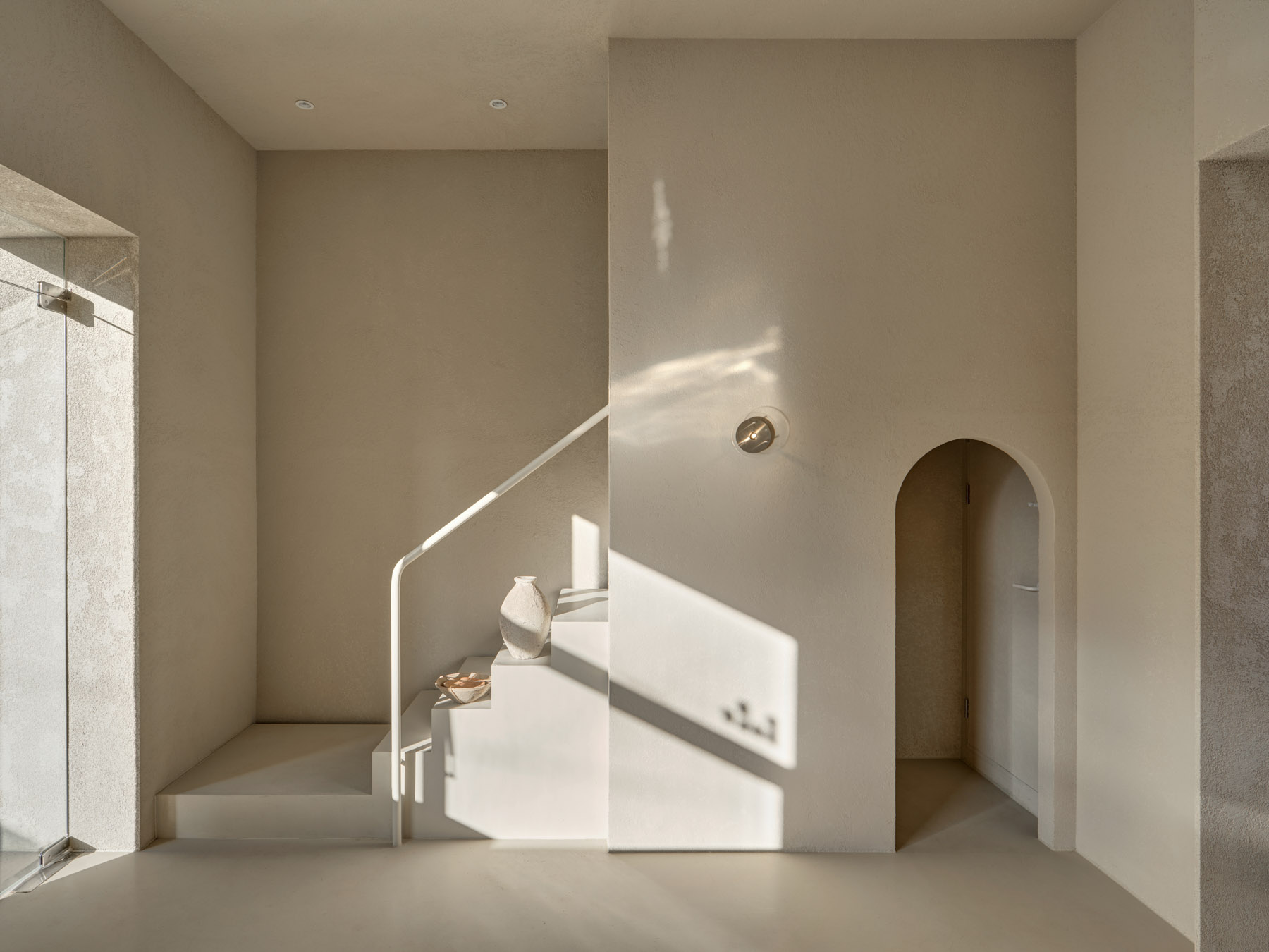
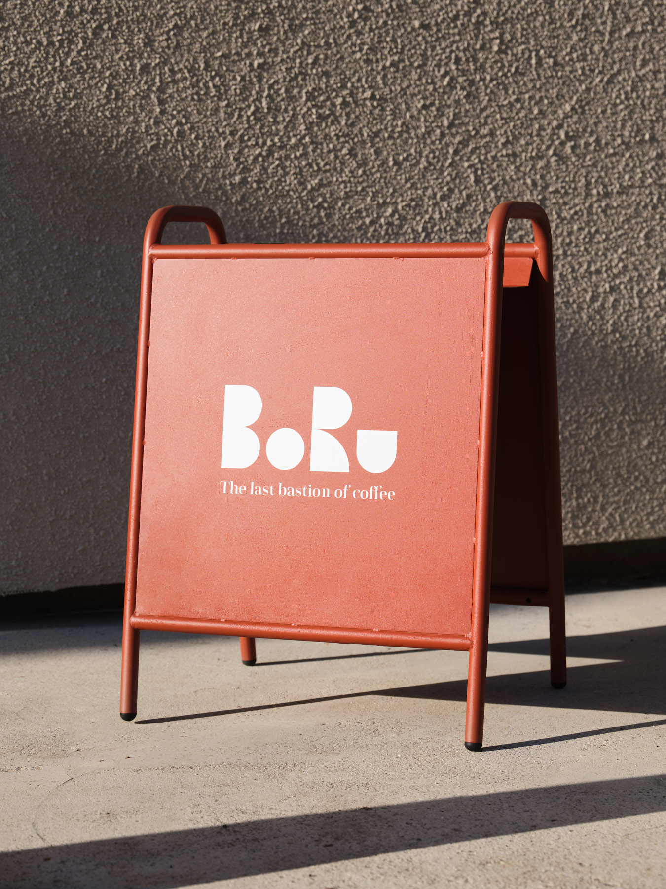
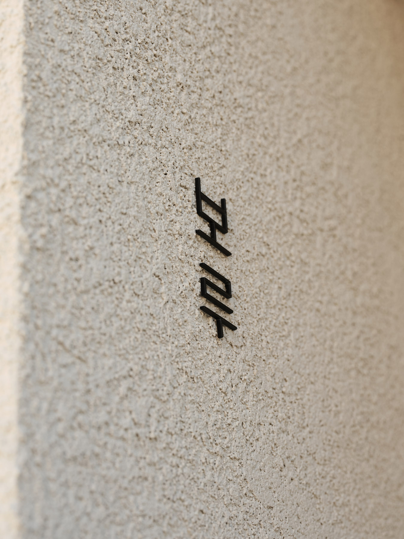
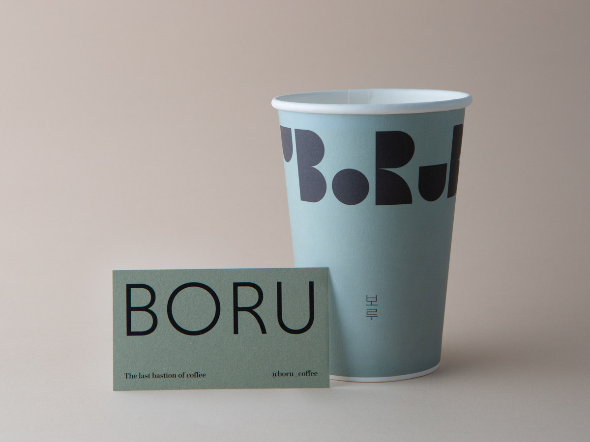
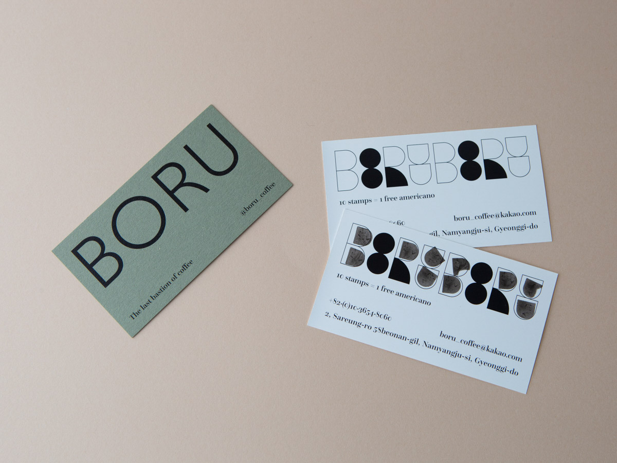
남양주에 위치한 카페 보루의 브랜딩을 진행했습니다. 높은 층고와 아치를 컨셉으로 하는 공간 컨셉을 고려하여 가느다란 선과 넓직한 면의 기하학적인 그래픽을 다양하게 변주하여 디자인했습니다. 예상하지 못한 위치에 자리한 카페의 특징을 이국적인 분위기를 강조하여 고유성으로 부각시키고자 했습니다. 부드럽고 건조한 질감의 이국적이고 여유로운 무드를 브랜드 아이덴티티로 구현하였습니다.
We conducted the branding for Cafe Boro, located in Namyangju. Taking into consideration the space's concept of high ceilings and arches, we designed a variety of geometric graphics, featuring thin lines and expansive surfaces. Our goal was to accentuate the cafe's unique characteristics as an unexpected gem in its location by enhancing an exotic ambiance. We implemented a brand identity that exudes a soft, dry texture, creating an otherworldly and serene mood.
September 2021
Client: RAW & CORE
Space design: RAW & CORE
Photograph: Lightraphy